PERFORMANCE
BUILT FOR THE CLIMB.
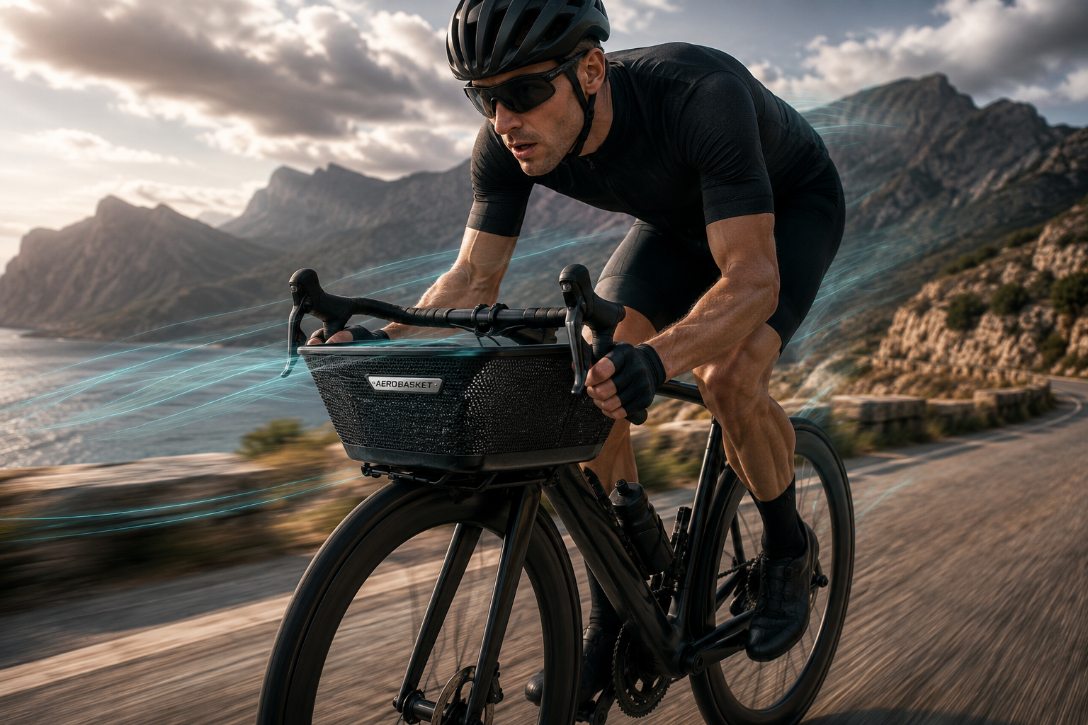
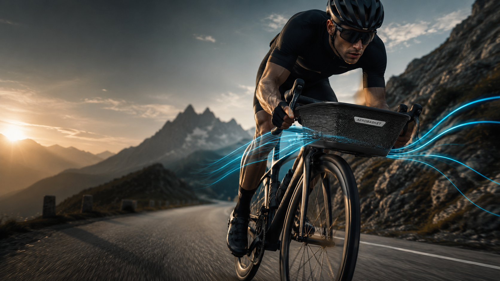
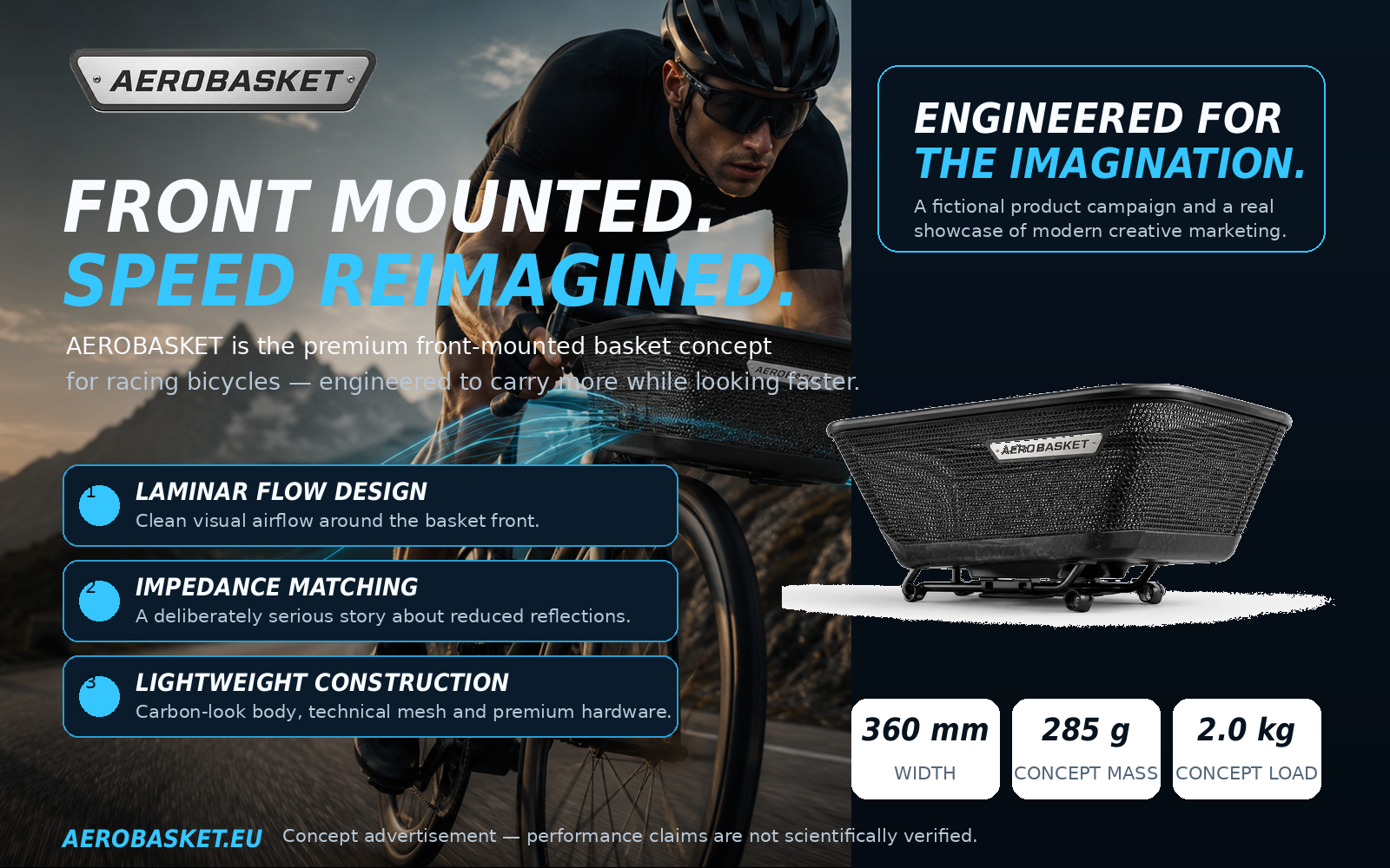
The dramatic action shot anchors the speed narrative and gives the concept a strong premium-sports entry point.
AEROBASKET / PERFORMANCE CARRY SYSTEM
AEROBASKET turns a playful idea into a fully realised premium brand experience. Product design, campaign imagery, editorial storytelling and a complete static website system come together to create the kind of concept people remember and talk about.
WHY THIS PROJECT WORKS
AEROBASKET works because it follows the same logic as a real product launch. It has a strong visual identity, a clear promise, consistent imagery, a believable technical vocabulary and a complete digital ecosystem. The joke lands because the execution is polished enough to feel real.
This makes the site more than a parody. It becomes a live demonstration of what generative tools can achieve when concept, copywriting, art direction and web design all support each other.
THE BRAND WORLD
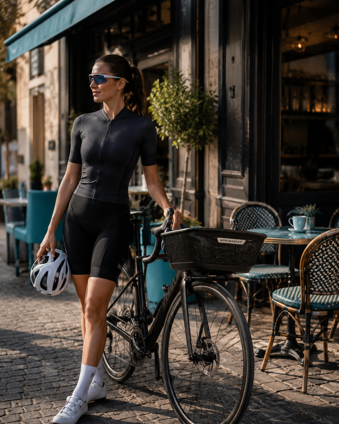
The campaign stretches across several use cases and moods. AEROBASKET belongs on a mountain pass, outside a café and in the city at blue hour — always recognisable, always slightly overconfident.

VISUAL SYSTEM
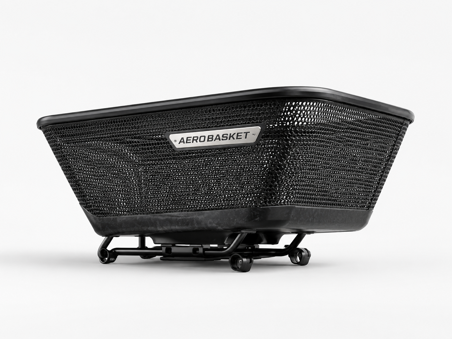
The visual system combines a dark premium interface, electric-cyan technical accents and bold condensed typography. The metal badge on the basket becomes the key brand anchor. The result feels somewhere between a high-end cycling product, a design object and a tongue-in-cheek engineering experiment.
EXPLORE THE SITE
A great concept site is not just a homepage. It is a complete narrative journey: promise, proof, detail, emotion and practical information.
Explains the playful aerodynamic narrative, the design language and the core brand logic.
02Presents dimensions, compatibility notes and fit checks in a clean, practical format.
03Collects the product, campaign and rider visuals in a full-size lightbox experience.
04Answers the obvious questions, addresses the concept nature of the project and offers a contact route.
“This is exactly the kind of ridiculous idea that becomes unforgettable when the branding is good enough.”
That is the real point of AEROBASKET: not to sell a basket, but to show what polished creative execution can do.
READY TO IMPRESS?